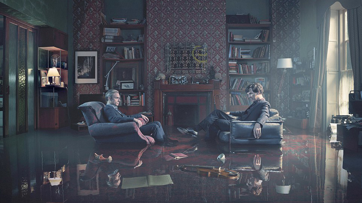
Two chairs. A fireplace. 17 steps leading up from the ground floor. On the mantelpiece, letters pierced by a knife, cigars hidden in a coal scuttle and tobacco concealed inside the toe of a Persian slipper… Sir Arthur Conan Doyle provided a few compass points from which set designers on screen adaptations of his Sherlock Holmes stories could work when creating their 221B Baker Street. The rest takes imagination, artistry, a storyteller’s eye and , in the case of BBC One’s Sherlock, the odd bit of mischief.
To celebrate the 10th anniversary of Sherlock’s arrival on the BBC, production designer Arwel W Jones lets Den of Geek in on the behind-the-scenes secrets of 10 sets.
Over to Mr Jones…
221B Baker Street
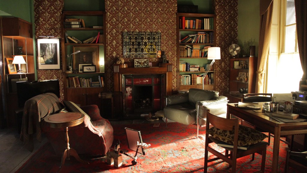
“Though technically speaking it was a Hartswood Production and not directly through the BBC, because we were on the plot in Cardiff’s Upper Boat [Studios] where Doctor Who was being shot, there was a big old prop store there that had a lot of things from Doctor Who and I did borrow a couple of things from there which maybe I should have hired… including some music manuscript that ended up on set. I hadn’t actually spotted at the time that it had some Gallifreyan text on it! So there is that little moment of crossover for anyone that really wants one.
John’s chair is that homely chair that everyone can probably remember their grandparent sitting in. It was a chair we already had that we reupholstered it in a nice tone that complemented the room. For Sherlock, I wanted something that was a timeless classic, like himself. As soon as we saw an image of the Le Corbusier… it ticked every box. It’s low at the back, for the practicalities of shooting, and had exactly that timeless elegance.
The skull was something I’d seen in a magazine, a differently shaped skull sprayed glossy black, and liked. Everywhere you go now you see skulls or bison heads, they’re in every tattooist, every barber shop, even in nice restaurants. I don’t remember seeing them much before that.
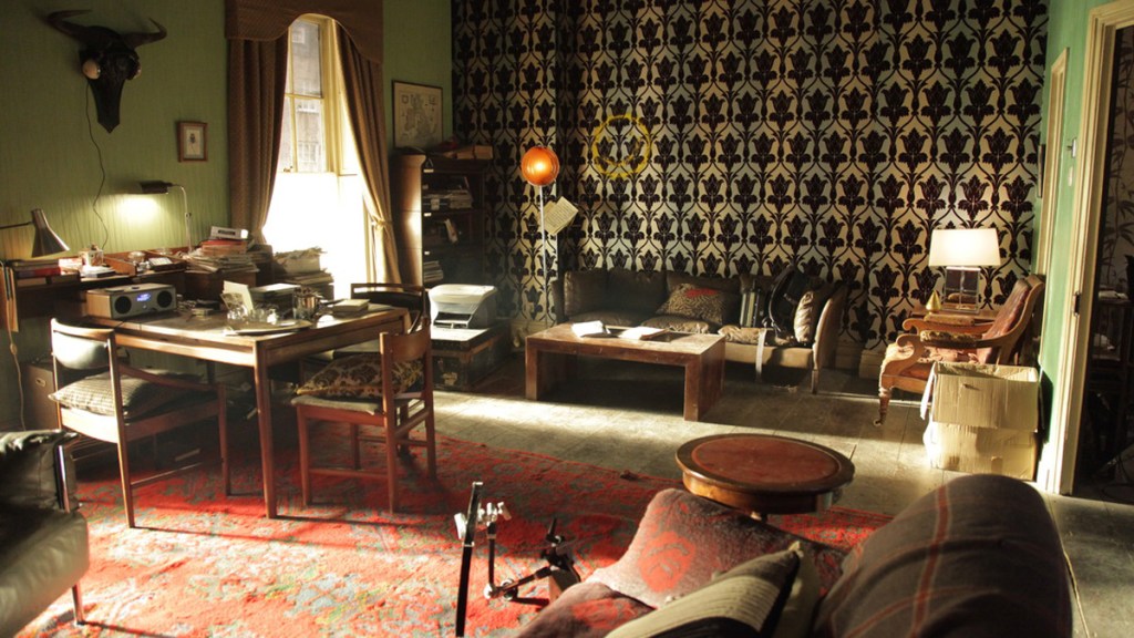
Often I won’t finish deciding on how to decorate a room until we know who’s been cast. The look of the actor affects what you’re doing. Once you visualise that person as that character, it makes it easier to visualise their space. 221B reflects the timelessness of Benedict. His outfits and his look would work in any era and that’s what I tried to do with the space.
It’s a transient space that had different levels of eras. No-one would really decorate their place like that! It did work though. Both Sherlock and John, no matter which wall you look at, if they’re framed against any section, with all those different styles and looks and textures, they look good against them.
Victorian 221B Baker Street

I loved what we were able to do with ‘our’ version of the Victorian one. I was lucky it happened that way round, rather than do just another Victorian 221B, it was a Victorian version of my modern one, which is slightly surreal.
It was about finding shapes, finding little things that filled the spaces in a very similar way, like the oil lamp that had the brass reflecting around it that was bang-on perfect the same shape and size as the 221B moon lamp in the same space. They were all hints that it was [taking place in Sherlock’s Mind Palace] but there wasn’t anything out of time. We were so strict on it because they didn’t want the hint to be there before. There were clues in dialogue but they were scripted. I didn’t want to be the bad guy who let the cat out of the bag!
The stuffed deer head with the ear horn was quite cool. I was very happy with the skull painting too. It’s a real Victorian image called ‘All is Vanity’ and it worked so well in that spot. It was very of the moment because of that obsession with death that the Victorians had.
I can remember the exact moment where we said ‘what shall we paint over there?’ and I went ‘Aha! It’s the study! We’ll do it in scarlet!’
Mycroft’s Office
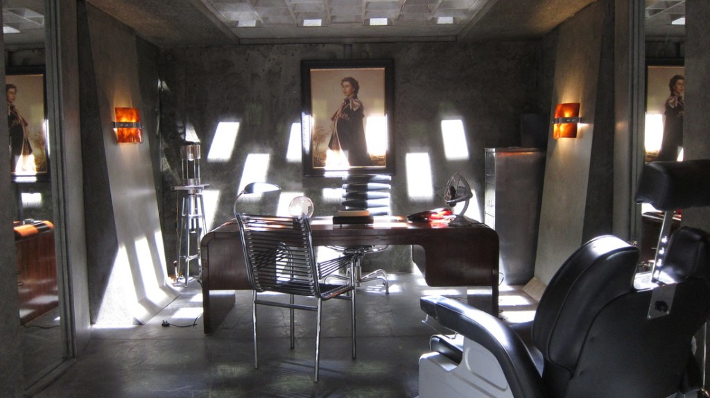
I wanted the idea that he was under your feet as you walked through Whitehall. The pattern on his ceiling is meant to be the underneath of those glass bricks that you walk over, that’s why that light comes in the way it does. We’ve always hinted that he ran the country, not the government and so he’s just there underneath, running everything.
When we did it the first time, it was the same time as doing the cell for keeping and interrogating Moriarty so we had that same feel.
If you look at the bare metal on the filing cabinets, everything is cold and calculated. The glass globe on his desk – world domination! All those things are there for a reason.
Eurus’ Sherrinford Cell
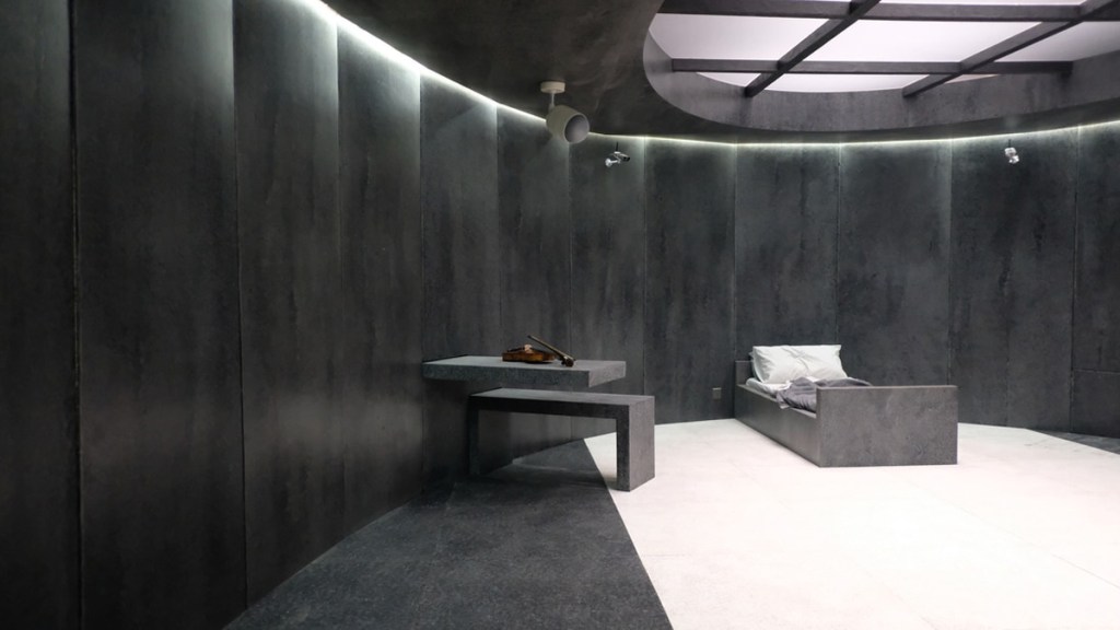
This is about the coldness of the character and her calculatedness. It’s a smoother shape [than Mycroft’s similarly toned office], the curved ellipse of that cell, there are no edges so you don’t know what’s what. The colours and the textures obviously say coldness, but the glass and the concrete and the bareness were really about how dangerous she was, with no resource.
There are a few little Easter Eggs in there. If you look at the floor and markings on the wall, there are scratchings on the floor where the toilet and the shower would slide out. If you look at the table and the bed, they look like they can slide back into the wall. The idea is that if they wanted to, they could just leave her in a completely empty space and that she would never have to leave it. The round grate on the ceiling echoes the bottom of the well [where Eurus put John and ‘Redbeard’] but also the depths of the island. She was right at the bottom, on the bottom layer, the most secure. We played with the idea at one point of making it feel like it was underwater and there was an element of that in some of the lighting.
I was obviously looking at a lot of reference from Bond movies. That was a real nod to [Bond designer] Ken Adams, because he’d passed away that year sadly.
Magnussen’s Mind Palace
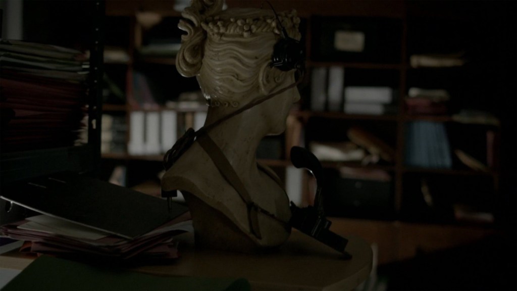
There’s a book [Steven Moffat and Mark Gatiss] would reference all about helping your memory and it’s to do with associating things with particular memories. The weirder the thing you associate, the easier it is to remember it. So they told me to find weird and wonderful things! We had a fiberglass baby hippo in a dog bed in one corner, a rabbit pulling something out of a hat, rather than the other way around, a tree draped with gloves.
There was all manner of things on top of every corner of these ‘corridors of information’, including a painting of me at the end of one of them, which I don’t think you really saw. When we were doing The Sarah Jane Adventures years ago, we had a haunted house and there were things falling off the walls. We couldn’t let a hired painting fall in case of damages so I got one of the scenic artists to paint me as Rembrandt. That’s the one we knocked off the wall, so I had it, so I just put it in there as an extra bit of weirdness!
John’s Pilot Bedsit
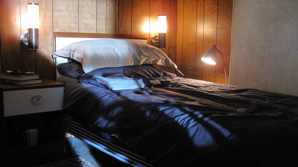
That was my favourite set from the unaired pilot. We were in the Coal Exchange in Cardiff that we were using downstairs for the therapist’s room and there was this little pokey room on the top floor. In the room next door they had that proper 1970s Sapele cladding, so I ripped that off one room and clad it around the one side. The tones of the bed covers and that Sapele and the lighting, it just felt like a miserable place, even though it had its own aesthetic.
This is what I keep going on about, even miserable places can have an aesthetic and look beautiful on screen. It added to his despair or his sense of not belonging. What we tried to do was recapture that in the first of the actual series. It was close, but I still think the one in the pilot was a better set in my mind. I didn’t quite get it right.
Read more
The Baskerville Laboratory
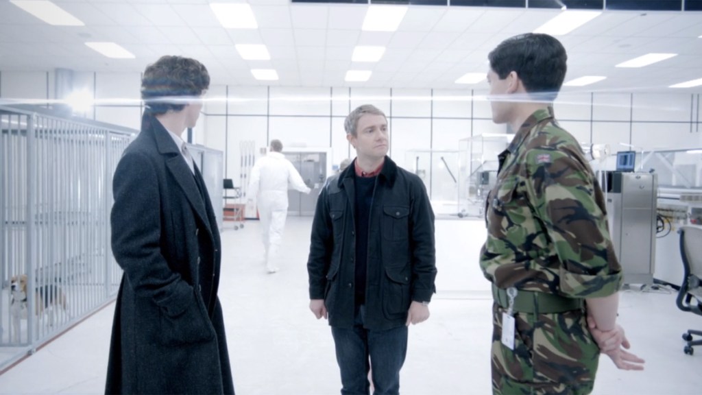
This was a real space, a microcomputer lab that had recently closed, so a lot of that was already there. I had one of the glass cases shatter on me, so I was standing in a pile of glass at one point while we were dressing that.
One of the team said she’d seen something on YouTube about how you could melt a plastic bottle and twist it into a jellyfish. We said, let’s have a go and that’s what the glow-in-the-dark jellyfish are, they’re all plastic bottles!
The monkeys were quite frisky! The male monkey really took a shine to the Grip. Really took a shine to the Grip. They had a tracking shot that was bringing the actors out of the elevator and every time the Grip passed the cage with the male monkey, shall we say he got a bit overexcited in an adult way, which was quite amusing to everyone there and very difficult for the cast to keep a straight face.
Culverton Smith’s ‘Favourite Room’
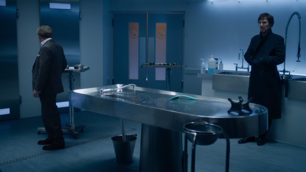
This was trying to have something that was really modern, because it was meant to be this brand new hospital he’d built and done all sorts of things to. We tried to go as ultra-modern in its feel, with all the LED lighting and the suspended lighting grid above the beds and the bank of coolers. It was about that feel of giving it complete coldness and newness. And having a viewing area, which was weird, but they do actually have that in a lot of mortuaries.
The wallpaper [in Sherlock’s hospital room next door] wasn’t TARDIS roundels, that was just nice wallpaper to give that room something extra. That was a real space, we built that extra wall into the Student’s Union in Cardiff.
John and Mary’s flat
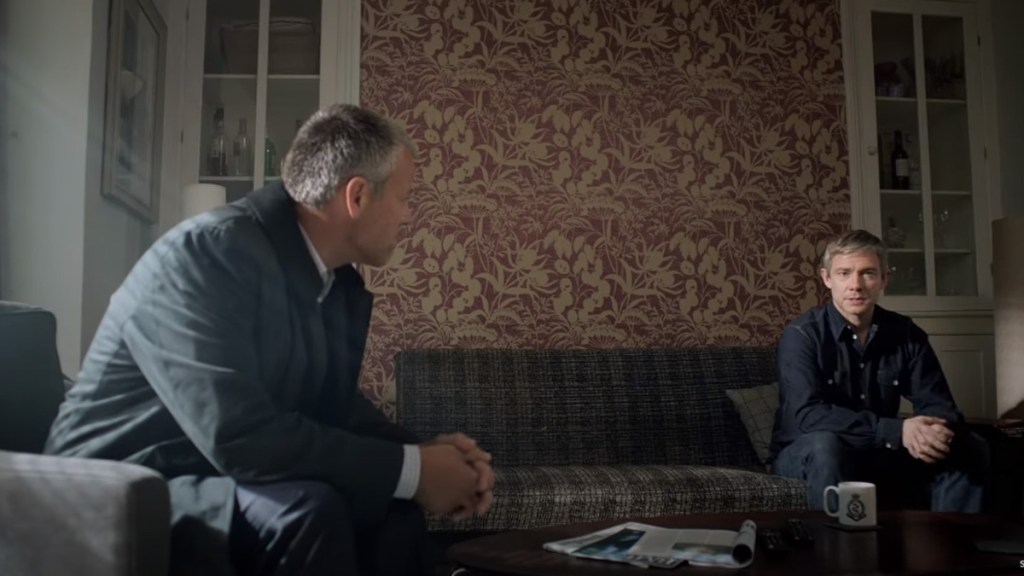
I don’t think there’s a shot that really reflects it in the series, but in that little Christmas teaser [‘Many Happy Returns‘] there was a shot of John sat on the sofa on his own and in that, there are reflections of 221B. The sofa’s in the same place, there’s a light on the left hand side that gives the same kind of lighting as the moon lamp in 221B and I put a little skull-shaped vodka bottle in the cupboard on his right in the same place that the skull image would have been in 221B, just little things. It was a very different type of wallpaper but still a feature wallpaper wall behind him. He hadn’t quite let go. It was the same but different, was the idea.
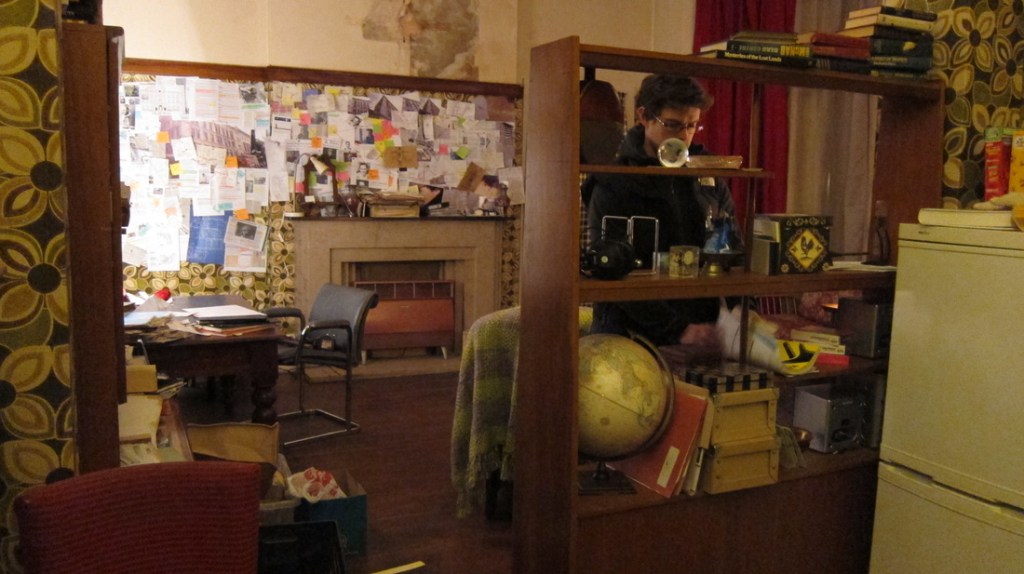
We did a similar thing in Anderson’s flat (see below) in ‘The Empty Hearse’. That was a dangerous one to do, because what we were trying to do was a 221B that wasn’t quite working, or wasn’t quite right. You could get that very wrong and just get a messy set that didn’t look right. That was a bit more challenging if anything. It was Anderson trying to create his own 221B.
[In Rosie’s nursery] and the bedroom, the tree and the fruits and the birds were a little reference to the décor of the wedding venue. It’s a nice wallpaper, also in Mrs Hudson’s corridor. The [black fish] mobile may have been a reference to what happens at the Aquarium, because we were talking about the cold, dead eyes of a shark.
John’s kitchen – even though we’d done the reflections of 221B in the flat, we also wanted to do the antithesis of it. The clutter of 221B versus the tidiness of that house. I read somewhere – biggest insult possible! – that it looked like an Ikea showroom of a house, which it wasn’t. There was a lot of stuff in there that was bespoke, but at the same time I can understand the reference. There were deliberately not a lot of signs of life, even the child’s toys are tidied away.
Scotland Yard
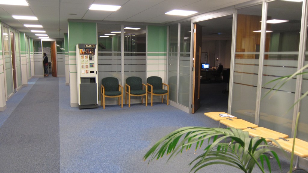
It’s been three different places over the years. The first time it was in the old HTV studios in Cardiff, which no longer exist. That was flattened and is now a housing estate. When we went to look at it it was in kind of a dark blue, which was never going to look nice on camera, but I was looking at it with [director] Paul McGuigan who is a very, very strong Celtic fan and he said there was no way he’d film anywhere that was Rangers blue! So that’s why I painted in green and white hoops like Celtic shirts. So that’s where that colour scheme comes from.
I walked him on there and he said ‘I like this’ and I said ‘Have you realised?’ and he’s going ‘What? What?’ So I tell him ‘Green and white hoops!’ And he went, ‘You legend!’”
