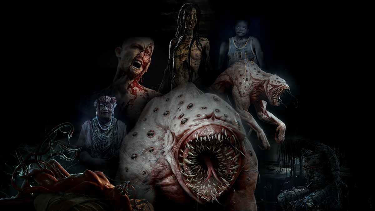
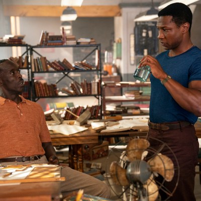
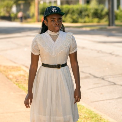
The finale of Lovecraft Country landed last night with a roar marking a closer to one of the most exciting, intelligent horror series around. As well as the characters, the settings, the history, politics and winding plot some of the biggest delights of the show are the monsters and monstrous effects within the show.
UK FX house Framestore worked across the whole of the show in different capacities, including creating early concept art of some of the show’s key episodes.
“You start with mood boards and it gives the director or the production designer a very clear idea of the yes and no camp,” explains Martin Macrae, Head of Art Department at Framestore, of how the process works.
Read more
“The photographic reference really helps you quickly narrow down areas which you don’t want to waste time developing. And it really helps you focus on something that they gravitate towards. So we do that first and then we go into quite quick sketches, usually thumbnail sketches or black and white sketches, just to try and get a flavor of where the design can go. Then we’ll move into working in 3D and doing sculpts, which really helps the design process. It’s that for characters as well as when we’re doing environments. Then we will render them up and paint them in Photoshop and it seems to work really well.” Macrae and his team worked on concept art for a range of creatures and characters in the show and he insists he doesn’t have a favourite.
“It was such a diverse brief, and I think all the characters and creatures are so strong in themselves, they were all equally challenging as well as exciting to actually see on the final screen!”
Here illustrated by original concept art from the show, Macrae talks us through the designs.
The Shoggoth
“We did some concept art for The Shoggoth. It’s a classic thing in the concept world that they hire a whole plethora of different concept artists for different parts of the show, the design bounces around. It’s different on every show, but sometimes it’ll start and end with you.
“So these ones here were some of the initial ideas that were quickly sketched out.
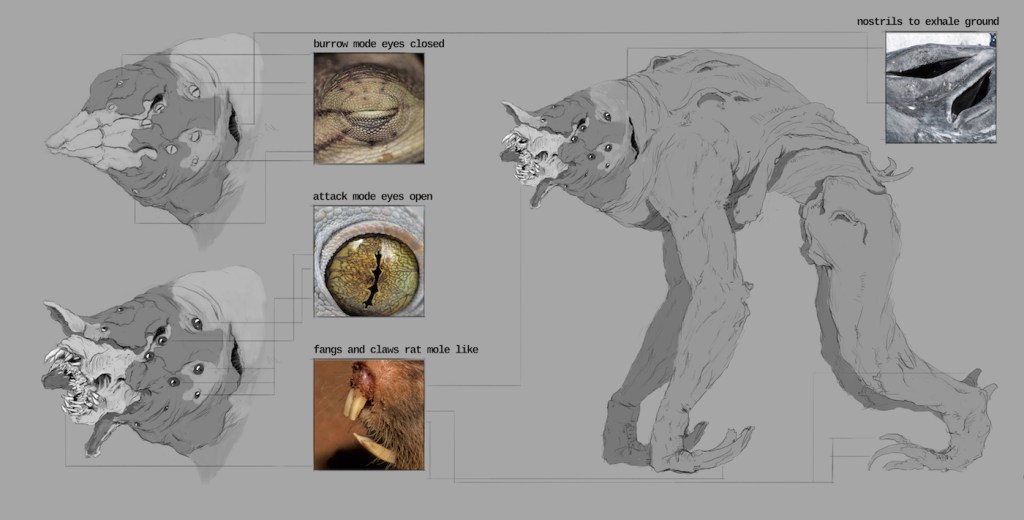
“As the story started getting solidified and it was clearer what they needed for each episode, they came back to Framestore with the Shoggoth to actually do the visual effects.
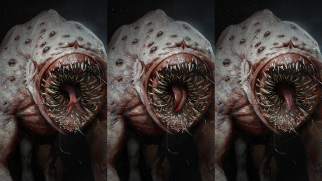
“There were a few extra things that they wanted to add in. The little arms underneath and the amount of eyes that they wanted over the body. Initially it was just on the front and then they said, ‘Oh, add some more to the shoulders.’ With the mouth, we were trying to determine how the layering of the teeth looked when it would open its mouth.
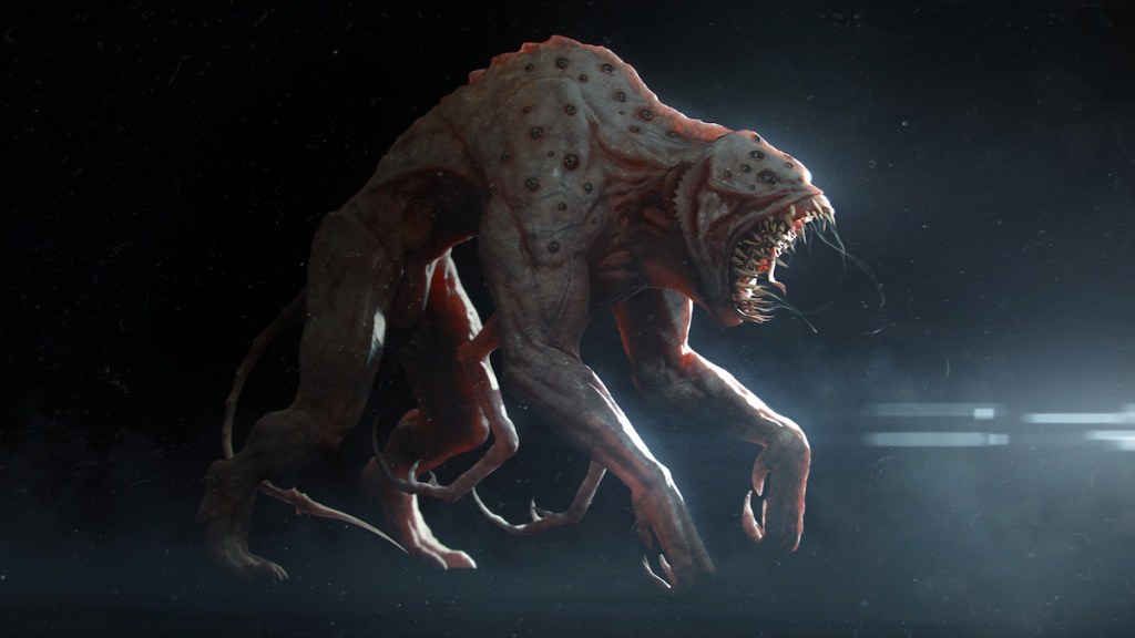
“Then we were also doing lighting tests. We were testing the subsurface of the skin because that would determine how close it looked to the skin on a human. Then if the tail was long, short, thin. So it was more refining the design.”
The Ghosts
“With the ghosts they had an idea of what characters were originally when they were alive. The classic one was the baseball player with the baby’s head. That’s the one everyone gets freaked out about. It’s an experiment that they were doing, which was pretty grotesque.
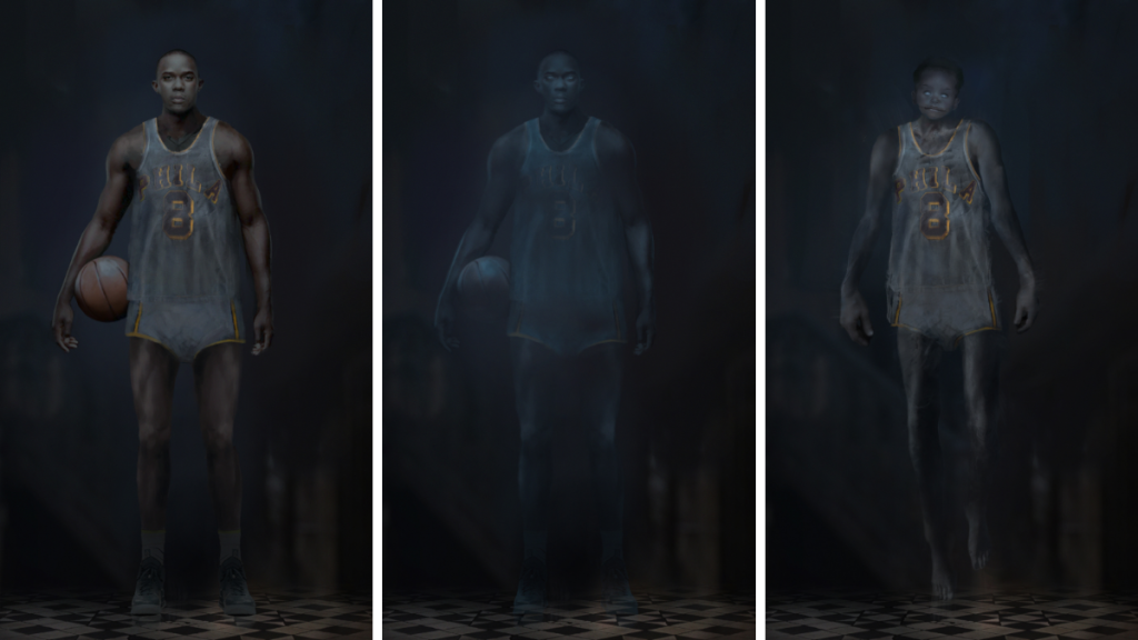
“It wasn’t a very nice one to actually research, for obvious reasons, because they wanted to show as much gore as possible. But they were pretty clear on the type of characters they were. We went off and started trying to make the character close to what they wanted, but also make it look like it was believable. We looked at how ghostly it would look as well when you saw them in the cellar and how transparent the ghost might be. And all these small things that they were asking about, we would just do that with a line of concepts. So then we ended up with almost like a lineup showing all the characters, how they would look before they died and then how they looked as ghosts.

“[Lucy] was about how much brain you show and how gruesome they wanted it to look.
“That was the main thing, is what was the most striking look that they could get away with? There was one character, I remember, that they literally wanted to show their guts hanging out, and how much guts we would see dangling out of the bottom of the torso.
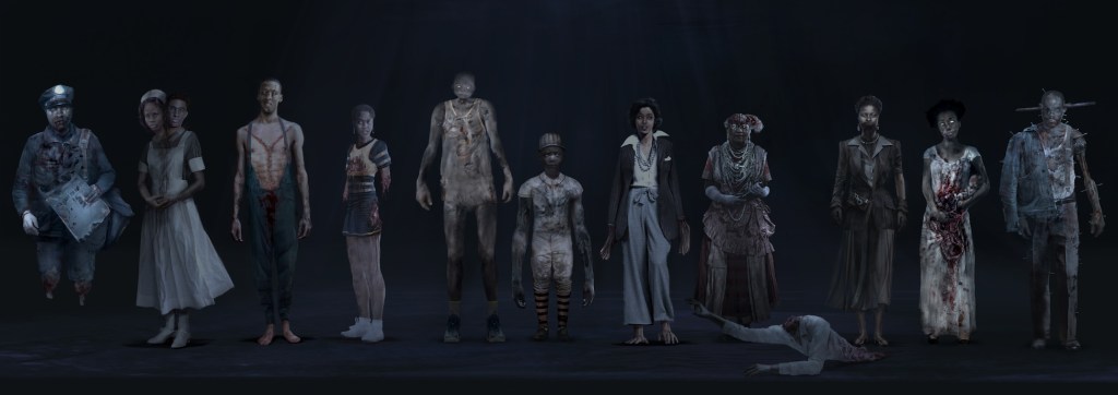
“I think the whole point of this was just trying to push the boundaries of what you could put on screen.”
The Transformation
“That was a gruesome one to do as well. I remember when we were doing the concepts, we thought, ‘Oh, this is pretty gruesome. They probably won’t do it as bad as this,’ but they actually made it more gruesome. They weren’t holding back.
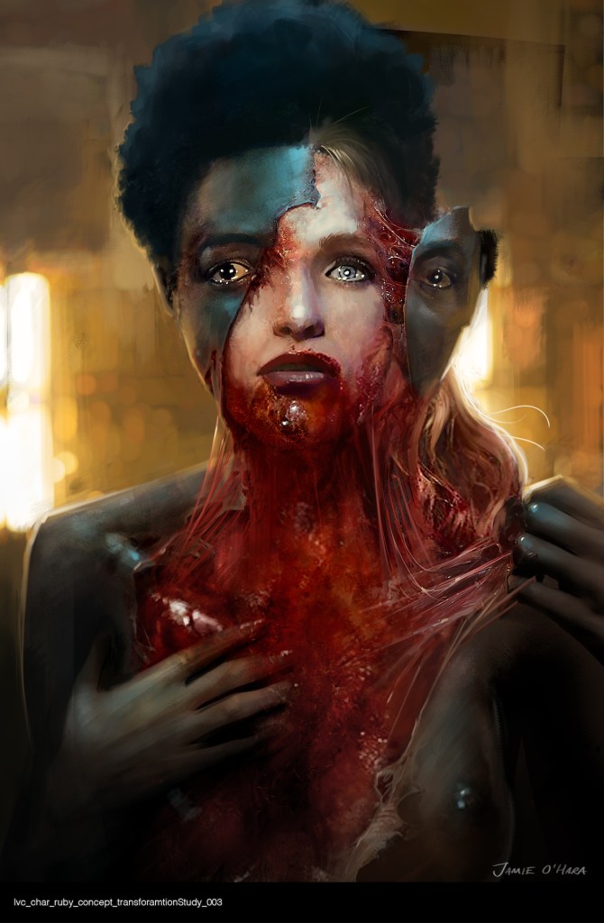
“All we were thinking was, ‘What would actually happen if you were rubbing someone’s skin off and there was skin underneath.’ So obviously you weren’t revealing sinew and muscle and tissue like that, it was how much blood would you see on the skin. It was all about how the skin would tear off and yeah, it was pretty gruesome.
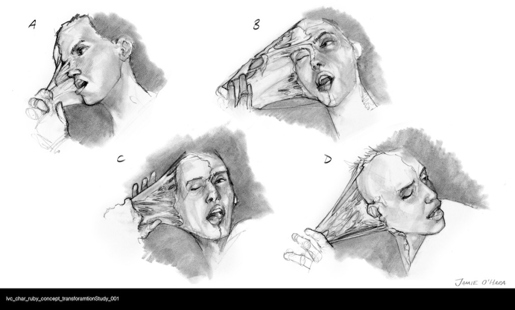
“We were sort of testing the water to see how artistic it wanted to look.
“Under The Skin was one reference point that was discussed. And then to full-on blood and guts. It was trying to find out where on the spectrum they wanted it to be.
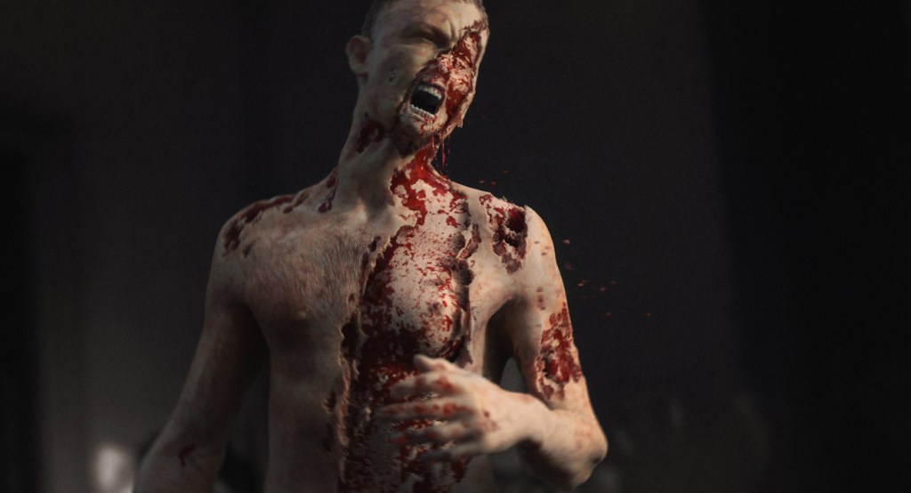
“It was important for them to get the sense of fear for the characters themselves. So I think they wanted to be able to, yes, show gore, but at the same time show the expression on their face as it was happening to them. Even though it was full-on gore, it had to show her emotion as the skin was pulling off. So it was a balance.”
Yahima
“Initially, the location of this was going to be in an old ship. With Yahima I think the main thing was initially, “How does she look when they actually first discover her?” And then you have concepts there to show the different stages and how she would have been originally and then how she was when she transformed.
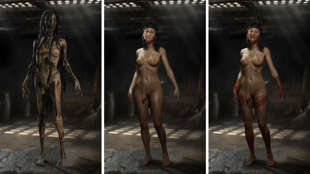
“The elements of adding the tattoos on her body was important for them as well. That was quite simple in a sense, where it was a before and after and you had to try and experiment with the design on both sides.

“[For the decayed version, the challenge] was to show the setting and not realize that actually there was a character sitting in the chair. We weren’t sure at that point how decimated the area of where she was sitting was meant to look. With the elements of that hair hanging down, it had that connection so it felt like she almost blended into the scene. That was the element of horror as well, when she came alive she wouldn’t have looked that different to where she was sitting or what she was leaning against, so the colors had to blend into the scene as well.”
Kumiho
“[We had ] the description of the mythology behind the nine tailed fox and [we looked at] how much they wanted to translate the actual fox mythology into her. So whether the tentacles, or what you want to call them, came out of her, if they were covered in fur or how closely represented to that mythology they were shown on screen.
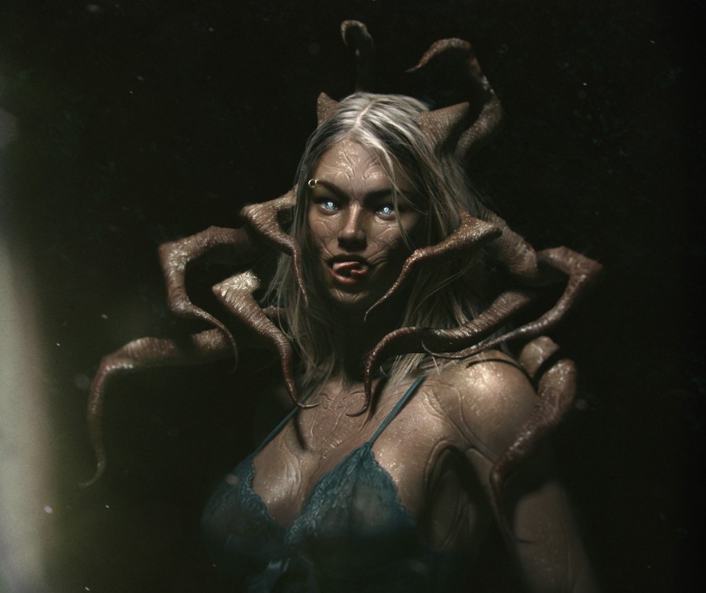
“The other side of it, as well, was how graphic they wanted it to look.
“Yeah, they were experimenting with different areas of where they were coming out of her and this was a very early concept, this one, where we weren’t sure if they wanted it to come out of her eyes and her nostrils or her mouth.

“This was us trying to experiment with how it would look when it came out of all orifices of her face. And then the scene on the bed was literally kind of an overview of how it would potentially look.
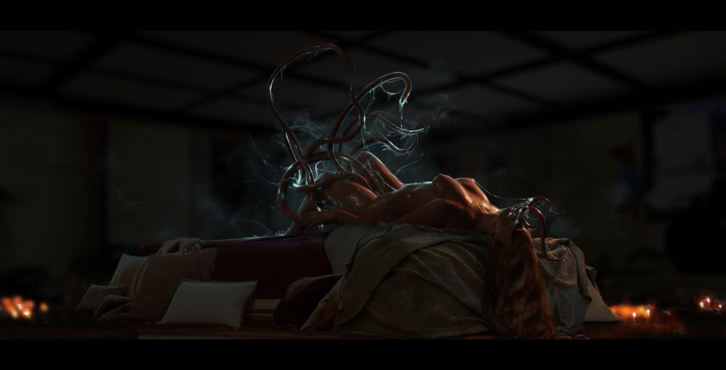
“Because they were discussing that it could also be always just seen as a silhouetted shadow and they wanted to know if it would work as a silhouette as well as something that was actually directly filmed.”
