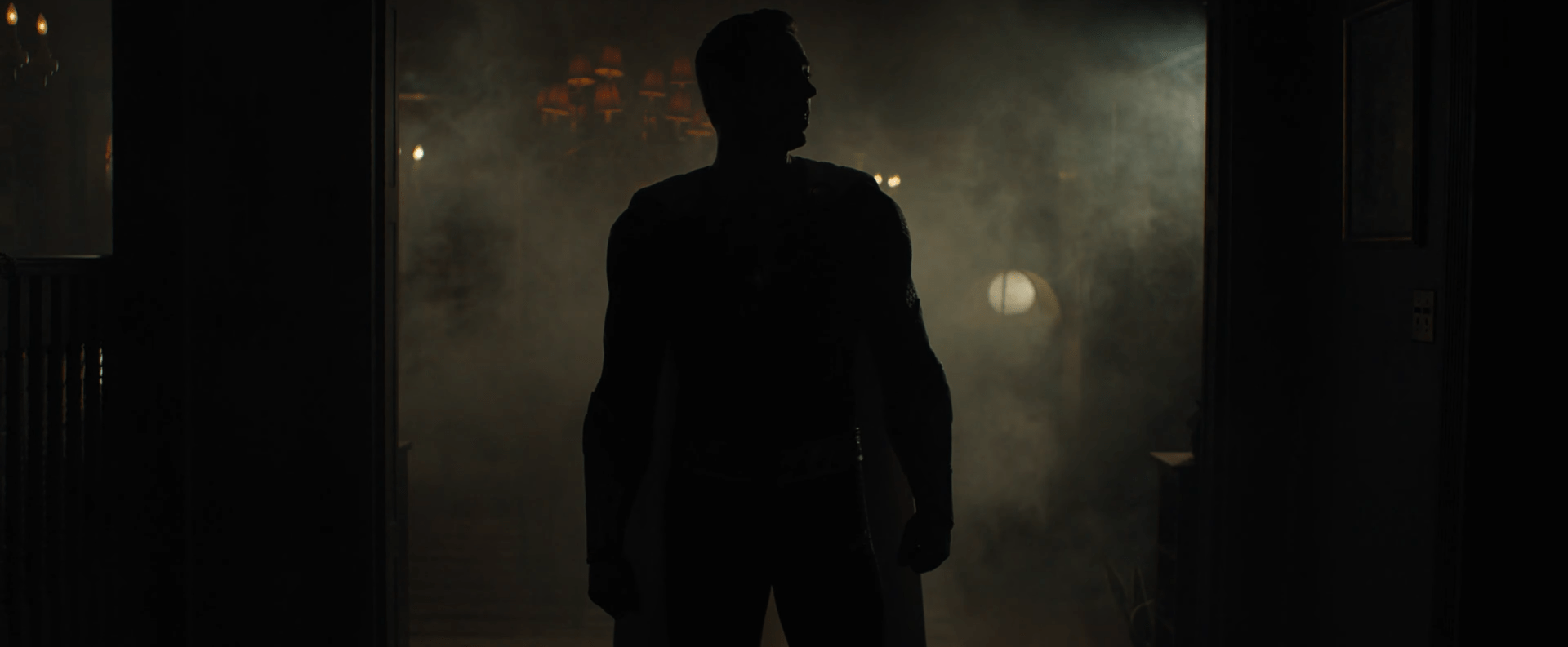
Shazam! is one of the very best DCEU movies, a perfect distillation of the heart and wonder of the classic character blended with modern sensibilities, aided by director David F. Sandberg’s eye for “just scary enough” ’80s-style family horror. The fact that we’re getting a sequel in almost exactly two years is cause for celebration, if some impatience. But Shazam 2, officially known as Shazam: Fury of the Gods, is now filming, which means that some looks at the DC movie are going to make their way out into the world…whether the filmmakers want them to or not.
But Sandberg has always been a savvy social media user, knows how to tease fans just enough, and also when to give them what they want. So with Shazam 2 doing some outdoor filming in Atlanta, and with the knowledge that folks were likely to snap photos of Zachary Levi’s new suit, the director decided to go one better and just drop the first footage (of sorts) from the movie himself…
Check it out…
OK, so…as Levi’s Shazam points out, this is pretty dark and there’s not much in the way of details we can see on the new suit just yet. But that’s what the paparazzi are for…
OK, so…this isn’t a drastic departure from the first film’s Shazam costume, but there are still plenty of notable differences, and overall I’d say it’s an improvement.
First up, don’t panic about the lack of a cape in these pics, this is probably from filming an action sequence that will require a CGI cape added in post-production, and there’s a physical cape clearly visible in Sandberg’s video. Those grey and silver highlights might be placeholders for CGI lightning that will course through the costume, too.
You can still see see the cape fasteners at his collar, and while it’s hard to tell from here, they seem to still have the symbolic “tiger” design from the first film. Tigers are important to Shazam mythology because of Mr. Tawny, an anthropomorphic talking tiger who used to hang out with Billy and everyone like this was just a normal thing. And why shouldn’t it be?
The lightning bolt logo is the first thing I’ll call a genuine upgrade. Slightly smaller than the previous costume, and slightly more angular, it feels more dynamic and, well, lightning-like. It seems like it still contains the practical “light up” element of the earlier suit, but it’s less obvious when not in use.
While all modern superhero suits are textured, that pattern we see spreading outward from the lightning bolt along the chest and shoulders feels lifted directly from Gary Frank’s Shazam comics design. Frank’s work has been a major influence on the big screen Shazam anyway, but this feels like a really obvious nod to that.
The red of the costume seems to be the same shade as the previous one, too, but the addition of the darker crimson along the sides makes the look more dynamic. There’s so much red in the suit, and it sometimes felt like it flattened out Levi’s form in the first film. This should help combat that effect. Similarly, the belt is a little more substantial, and the fact that it’s less angular keeps the torso from feeling too “long.”
But my favorite new detail has to be the gauntlets. These feel much more explicitly like a warrior’s gauntlets, like something you’d expect to see on Ancient Egyptian or Greco-Roman armor. It’s no coincidence that concept art of Dwayne Johnson in his Black Adam costume appears to show off very similar gauntlets. Shazam and Black Adam draw their powers from the same magical source, so there should be visual continuity between the two.
The boots don’t look like a drastic departure from the earlier version in terms of size and shape, but they have definitely tightened up that “sandals” look they had before into something a little more traditionally “boot-like.” While I always appreciated the “gladiator” look they were going for with that before, it was never really one of my favorite features of the costume and it always felt a little awkward.
What’s really refreshing is that they seem to have cut down the overall muscle padding, particularly in the shoulders. While all big screen superheroes have enhanced musculature these days, the padding in the previous suit was downright disproportionate in places, and that seems to have been fixed here.
Overall, this looks like a really powerful look for the suit. There’s probably lots of small details that we won’t be able to see until official hi-res photos are released. The first suit was full of little touches and symbolic callbacks to the ancient source of Shazam’s powers, as well as the comics.
The big question now is whether or not there’s an in-story reason for the change in look. Presumably, Billy Batson’s look is influenced by his subconscious ideal of what a superhero should look like, which explains things like the brighter red, the bigger logo, and perhaps even the outsized muscles in the first film. But with Billy a couple of years further into his teens for Shazam 2, perhaps those ideas have “matured” a little, too.
We’ll find out when Shazam: Fury of the Gods opens on June 2, 2023.
